Friday, November 25, 2011

Final thoughts on #BDC192

Here we are, the final week of BDC 192. A little sad for me - I genuinely enjoyed the course, and counted it among my favourite classes this semester. I felt like I could take something away from every lecture, I threw myself into the assignments with enthusiasm, and made quite a few friends in the lab.
Despite the early lecture time, I didn't find myself dozing off anymore after the first couple weeks. Part of this was thanks to the "cool finds" Laurie showed every week, which I always looked forward to. One in particular that I liked was "Her Morning Elegance" - I actually downloaded the song afterward.
I've definitely been affected by the course. Not to brag, but I think I'm pretty good at After Effects, Photoshop, and Illustrator, and it's sparked my interest in graphic design. My trailer for "White Chicks" in particular is a piece I'm really proud of, and I could see myself doing work like that in the future. Maybe not as my main profession, since I feel called toward on-air work, but it would be really cool to apply myself creatively to graphic design on some sort of professional level.
(c) William Reid
All in all, I think the big thing to take away from BDC 192 is that there is a lot more to digital media than meets the eye, and a lot more ways to apply these media than one might think. Whether in the realm of internet, TV, radio, gaming, or any other branch of digital media, there is a lot of room to be creative.

Sunday, November 20, 2011

Interactivity + Web Media

This week's lecture was particularly interesting, because an avid web media user and gamer, the content of the lecture was particularly intriguing. Here are three concepts that particularly stood out to me:

1) Gamer demographics
I was really surprised by some of the statistics related to gaming. I never would have guessed that the average game purchaser is 39 years old, but thinking about it, it kind of makes sense; if the statistic is related specifically to the purchaser, parents are usually the ones who buy games for their kids. Which, as long as middle-aged parents aren't buying Grand Theft Auto for their 10-year-olds, is reasonable.

2) Alternate Reality Games
I'm a little unsure as to whether or not The Sims counts as an ARG. I don't think it does, but from the moment ARGs were mentioned in lecture I was pondering this for the rest of the session. Technically it does take place in an alternate world, but this world shuts down when the player signs off. Plus, there aren't really plot-based puzzles, and it doesn't technically take place in real time. A bit of a shame, really, since I've been an avid Sims gamer for over five years. Perhaps a slightly closer comparison could be made with the Nintendo title, Animal Crossing, which actually does run in real time and continues to progress even when the player isn't gaming. I haven't played the game in years but I think I still have the GameCube disc, so it might be interesting to pull it out and see what's happened in the world of the game since I last played...

3) HTML
Before the lecture, I understood what HTML was and had a basic knowledge of how it works, thanks to my experience on fan pages and message boards. However, I didn't really have a thorough knowledge - not to say that I do now all of a sudden, but I now realize there's more to learn. Essentially, my ability to code HTML doesn't reach much further than embedding content, such as pictures and YouTube videos, as well as basic things like bold, italics and underline. I learned, in very basic terms, how to code a website in high school through Dreamweaver, but clearly there is a lot more to know.

Saturday, November 12, 2011

Sneak Peek: Motion Graphic Assignment

Only a few more days until the motion graphic assignments are due! Unlike most people, I'm not using filmed footage; instead I decided to generate my content digitally. Using the movie "White Chicks" as my subject, I've come up with a few cool ideas (at least, I think they're cool).
For my title card, which will end the clip, I thought I'd give the logo a 3-dimensional look, so that it doesn't just look like words on a screen. I used the drop shadow, bevel and emboss, and stroke features in photoshop to do this. Also, I've used stick figures as the I's in both words, because it ties into the rest of my clip.

The movie's plot involves two black FBI agents going undercover as white women, so in asking myself, "how do I convey this extremely bold and profound concept in five seconds?", I decided stick figures would be the most unique way of doing this. Now it's just a matter of getting all my ideas into place to make a really cool trailer!

Friday, November 4, 2011

Internet Memes and What They Mean to Digital Media

This week, I thought I'd talk more about the online sensation that is the internet meme. Of all the topics we've covered thus far in BDC 192, motion graphics have been among my favourite, because I find GIFs so amusing. But GIFs only encompass a small subcategory of internet meme culture.
By definition, a "meme" is "an idea, belief or belief system, or pattern of behavior that spreads throughout a culture either vertically by cultural inheritance (as by parents to children) or horizontally by cultural acquisition (as by peers, information media, and entertainment media)" (UrbanDictionary.com). So an internet meme would be a meme spread throughout culture through the digital medium of the world wide web. This could include virtually (see what I did there?) anything that can be transferred online; pictures, videos, sound clips, etc.
One of the things I love about internet memes is that they make participating in the online world so much more fun. For example, literally anyone with an internet connection will tell you that wasting away hours watching popular YouTube clips is among the easiest things a human can do. Take, for instance, your average adorable cat video:
When someone sees something like this that they enjoy, they instinctively save/bookmark it, send it to their friends via a social medium like email or Facebook, or add a comment about the video in the box below the clip. And so, a meme is born.
Internet memes are also used to express emotions. More and more people take part in online communities, such as tumblr, Oh No They Didn't, and various other social spaces that are either general or more niche (e.g. a Harry Potter community message board). If a user wanted to express excitement, wouldn't it be more fun to post a GIF such as the one below, rather than type, "omg i'm so excited!!"
These are but a few examples of why internet memes are changing the way people engage digital media, but in my opinion, it's definitely not a bad thing!

Tuesday, October 25, 2011

AfterEffects Motion Graphic: A Work in Progress

With the Motion Graphics assignment looming, everyone's slowly moving from the planning phase to the production and implementation phase. I guess this would also include myself, however my idea is still more of a concept and in the relatively early stages. In talking to Laurie, I've decided to go with one of my two ideas, which was for the movie "White Chicks" (a personal favourite).
http://www.movieposterdb.com/poster/716f3e63
The movie's logo uses white lowercase i's overtop black lowercase i's to give the illusion of male stick figures, but that's as far as the figures are used in the film's branding and marketing. My idea is to take this branding a step further in my motion graphic. For starters, I plan on creating my own stick figures inspired by the ones found on public restroom doors -- in Illustrator, at Laurie's suggestion. The plan is to have two black stick figures move, in stop-motion, through some sort of screen and come out on the other end as white female stick figures. This summarizes the basic plot of the movie: two black men go undercover as white women. The music would go from something more urban (stereotypical, I know, but reflective of the film) to some sort track that would be more identifiably feminine. At the end, I think I'd have the name of the film in a similar, but not identical, typeface to the one shown above, though I don't want it to look like a copy. For now, I'll have to work on nailing down a solid concept, but I'm excited to get to work!

Tuesday, October 18, 2011

Week 7: Typography

1. PlayStation 3
(http://tinyurl.com/n6gwl7)
Although the PS3 logo has been revamped since its launch in 2006, its initial logo was what is referred to as "the Spider-Man font," taken from the most recent Spider-Man franchise. Although the article this image is sourced from does point out that a factor in PS3 using this font was that its maker, Sony, already owned the Spider-Man rights, the use of this typography is still effective in channeling the system's target demographic; the Spider-Man viewer audience of young males is also the target consumer group for video games, so using the identical typefaces was certainly a clever decision on Sony's part.

2. The Walt Disney Company
(http://tinyurl.com/3qdl7sd)
The Walt Disney Company logo is one of the most iconic and easily-recognized in the world because of how distinct it is. The use of its founder's signature as its logo creates an emotional familiarity between consumer and corporation, one which the Disney brand is synonymous with. Disney fans are known to be extremely loyal as consumers, and the fact that the logo has remained the same basically since the company's inception has helped to keep this loyalty strong through the ages.

3. Nike
(http://tinyurl.com/3wk7q6h)
Like the Disney logo, Nike's is also iconic, but largely because of its signature "swoosh" symbol. The simple typography used on the word "NIKE" serves not to distract from the image. Seemingly made in "Impact" font, the typography is also italicized which works well given that Nike is a sporting goods company; the italics could be seen to represent swiftness, speed, or movement. 

Saturday, October 15, 2011

Motion Graphics - aka, my top 5 favourite GIFs

As an avid internet user, I'm already very familiar with motion graphics. My area of expertise lies in the realm of GIF files related to internet memes, popular on such websites such as Tumblr. I actually have over 530 GIFs in a folder on my desktop, so it is literally impossible to pick one as my favourite. Instead, I'll compile a top 5 list of my favourite motion graphics!

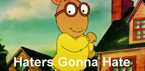
5) Arthur - "Haters Gonna Hate"

This GIF pretty much embodies what I love about internet memes: taking something and putting it into a different, usually humorous context. Also notable is the fact that the colours have been slightly edited from the original media, seemingly to give it a glossier look.

4) Excited Beyonce
 I really like this GIF for two reasons. First, it's edited really well; GIFs are essentially looping animations, but in this one it's hard to tell where exactly the loop cut is - it flows really nicely. Secondly, the maker of the graphic edited it so that Beyonce is the only person moving in the clip - everyone else is frozen in each frame, which makes it look very cool.
Plus, I really like using this GIF whenever I refer to a song/movie/generally any other piece of media I consider "my jam" (i.e. "that's my JAM!!!")

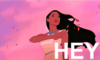
3) Pocahontas - "Hey Gurl Hey!"
This GIF, aside from being humorous, also shows off another cool thing about motion graphics in general: the many ways to use text. Instead of having the entire phrase up for the duration of the loop, the creator lets each word flash for a few frames. Just an interesting detail. Plus, I've had "Colours of the Wind" stuck in my head literally this entire week, so I had to include my girl Pocahontas in my blog somehow.

2) Woody - "I Can't"
This one's really only on the list because I made it myself, without any prior training in photoshop, so I was pretty proud of myself to figure out how to make a GIF almost entirely on my own (except for an online tutorial or two). The "I can't," well, I'll let Urban Dictionary explain what that means in internet lingo: http://bit.ly/rgvJNg

1) The Oprah "Ugly Cry"
This is my favourite motion graphic, probably ever. GIFs of Oprah Winfrey crying are abundant on the web, and it's well-known that no one does a full-out ugly cry quite like Oprah. This GIF is perfect for expressing a wide variety of emotions: extreme joy, extreme sadness, extreme excitement, etc.

Saturday, October 8, 2011

My Poster!


My poster is an advertisement for rapper Kanye West’s 2007 album Graduation. Taking inspiration from West’s actual marketing campaign and design scheme for the album, my poster features certain trademarks of the Graduation era, including the teddy bear mascot and the “shutter shades” sunglasses. Additionally, a similar colour scheme to the actual album was used in the poster, to create proximity between the two images. The bright colours, youthful font, and familiar mascot all serve to effectively meet the target audience in a unique manner.

In order to incorporate the elements mentioned above, I took photos of a teddy bear in my house and a pair of shutter shades I purchased around the release of the album. Once I had the photos in Photoshop, I removed the backgrounds of each image. I used the magic wand tool to select the entire teddy bear and paint over it to make it look like a cartoon, a technique I repeated on the glasses. To create the new background, I used the rectangle tool to create a rectangle that covered the entire canvas, and used a gradient to go from purple to yellow. I wanted to use purple because the actual Graduation album is primarily purple, and I chose yellow as a second colour because it complements purple on the colour wheel. I used a gradient overlay to make the two colours fade into each other. In terms of the text, I chose a modern font that was close to the one used on Graduation’s cover, but still distinct. Additionally, I capitalized only the “Y” and “W” in “Kanye West,” just as on the album. By duplicating the text several times, lowering it and reducing the opacity by 10% each time, I was able to make it appear as though West’s name flew up to the place it is in. A similar effect was used on “The New Album” and “In Stores September 11th,” but instead the duplication occurred on both sides of the text. These two phrases additionally were lined up with one another, a technique learned in lecture called alignment.

Tuesday, September 27, 2011

Something very interesting I just found on tumblr...

(all images via tyleroakley.tumblr.com)

Scrolling through my tumblr dashboard this evening, I came across these images in a photo set that someone posted. Obviously I thought of my digital media class. It's really interesting to see all this data regarding the ties between colour and culture, colour and branding, colour and science. There are also a couple little facts in here too; most notably, I knew blue was a popular "favourite colour," but I had no idea it was that popular! It makes so much sense now, though, looking at how many logos are primarily blue and what that colour represents. All of this reinforces for me just how detailed advertisers get in their research. Incredible.

"Let's Talk iPhone": Apple's Influence on Digital Media

This morning, Apple Inc. announced that it will hold a press event at its headquarters on October 4th at 10AM Pacific Time regarding its iconic iPhone device. Speculated to be the launch date of the next-generation iPhone model, an invitation was released to the media with the tagline, "Let's talk iPhone," as seen below. And that's exactly what I want to do.
Arguably more than any electronic device in recent history, the iPhone has revolutionized the cellular phone market in ways unimaginable just a few short years ago. Even in the mid-2000s, it would have been unheard of for portable gaming, a GPS system, an mp3 player, an internet browser, and more to all be standard equipment on a cellular phone-- but here we are. As the iPhone has forced the evolution of modern technology, so the device itself has evolved; greater hard drive capacity, higher pixel density for a sharper screen resolution, improvements to its camera & video recording with each model, and better app organization are only some of the ways in which the iPhone has improved since its 2007 debut. Apple has single-handedly made such features the industry standard, and with the iPhone 5 seemingly around the corner, it appears the company plans on dramatically changing the face of the smartphone landscape once again.

But what does all this have to do with digital media? Marshall McLuhan famously envisioned a "global village", wherein the whole planet would be connected instantly through media. McLuhan was certainly ahead of his time with this vision, but the iPhone has made the concept of the global village a very, very real thing; in fact, it has taken the idea of a global village to the next level. Sure, mp3 players, cell phones, e-mail, and GPS systems have existed for quite some time, but the iPhone puts all of these features together on one incredibly easy-to-use device. In fact, the iPhone's touchscreen interface has been heralded for its simple and effective design which truly enforces ease of use. It literally puts the entire world at its user's fingertips, bringing to reality McLuhan's vision in a way I'm not even sure he could have imagined. It has made digital media an integral part of 21st century life. 

Critics may lambast the iPhone as nothing but a fashion statement, a toy, even a false idol. While there is absolutely some truth to these claims, and I'm not trying to paint the iPhone as the Jesus Christ of technology, its influence on modern culture should not be denied or belittled. What would 2011 be like without the iPhone? How would the smartphone industry, or the cell phone industry in general, be like if the iPhone never came to be? What would the digital media landscape look like? These questions are incredibly difficult to answer, which proves at least one thing: the iPhone has changed the world as we know it. And on October 4th, it seems Apple wants to do it again.

Sunday, September 25, 2011

CRAP!

C: Contrast
This image, the logo for the popular sitcom Modern Family, works well as an example of contrast for a number of reasons. First, the fonts in the logo contrast one another; the word "modern" employs a more simple font, whereas the word "family" is written in a Times New Roman-esque type, typically considered old-fashioned. Also, where the first word is written in black, the second is accentuated by a brighter orange; while they are not exactly complimentary colours, they are clearly differentiated. Clearly, an effort was made so that the words "modern" and "family" would appear very distinct when placed side by side, which is why this image effectively exemplifies contrast.

R: Repetition
In this image, repetition is used to convey the old-fashioned Western theme of the poster. Used to promote a Toy Story-themed attraction at Walt Disney World, the same font style is used in the phrase "Classic arcade fun- bank on it!" as well as "Always exciting, never boar-ing!" This font repetition is used in other parts of the poster as well. This serves to unify the poster in order to unquestionably get the Western theme across to the target audience.

A: Alignment
This use of alignment is effective because the beginning of each line is on the same side of the disc cover, making for easy reading. The viewer can read the song title and artist on the left side, look further down on the left to notice the parental advisory warning, and subsequently look at the picture of the artist. In this way, the image also falls under the proximity category; it serves to organize the space on the image well, everything in the image appears to fall into its own category and the image does not appear cluttered, yet almost all the space is used up.

P: Proximity
This poster, promoting Ryerson's 2011 Week of Welcome, is an excellent example of proximity. Related items, in this case the events happening during the week, are grouped based on the day on which they occur. These groups are easily identifiable because each day is a different colour. Because each day is separated into its own row, it is also an example of alignment, and the colour scheme is also somewhat repetitive as well; white and yellow are used repeatedly to make the text stand out.

The benefits of the CRAP system are limitless, as seen in the above images. The system serves as a guideline to ensuring an effective piece of work which will create a connection with its viewer. However, one slight issue I have with the system is that it kind of limits creativity; yes, the examples above are still highly creative and unique in their respective designs, but there really are no rules to creativity; sometimes, something just looks good because it does. You could say it has a visual x-factor, that indescribable something that makes it visually appealing. I do recognize, however, that such cases are highly uncommon and that the CRAP system does serve a very useful purpose, with countless examples surrounding us everywhere.

Thursday, September 15, 2011

Digital Media Lecture Reaction - The Digital Footprint

Prior to today's lecture, I was fairly knowledgeable on the concept of a "digital footprint." I understood that everything I do online is viewable by anyone who wants to see it, be it family, friends, future employers, or complete creeps strangers. Accordingly, I knew that I had to be a responsible user; even the most insignificant, spur-of-the-moment online post could one day come back to haunt me if I wasn't careful. Having been on Twitter since early 2009, and Facebook since 2006, I learned fairly quickly that privacy settings are an internet user's best friend.
Personally, I don't have a problem sharing my life through social media. In fact, social media makes sharing my life and interests all the more entertaining. Anyone who knows me is fully aware of my obsessions, such as:
-The Toy Story movies

-Oprah

-and humorous YouTube phenomena.

The things I discuss on the internet aren't offensive or likely to come back and haunt me one day, so I don't go to great lengths to censor myself aside from trying to be respectful. Basically, I've got nothing to hide. However, I realize that there are people unlike me, who prefer to guard their lives entirely. Unfortunately, that's just not possible anymore without missing out on a pivotal part of the 21st century online experience.
My personal policy in maintaining an online presence works well in terms of being able to participate in the digital realm to the fullest. Like I said, I'm very active on Facebook and Twitter, in addition to Tumblr and a couple of online communities. I'm a very open person, so my online presence should reflect that openness, shouldn't it? I realize that this causes my digital footprint to be more significant than others, but I don't think that's a bad thing - as long as you're careful.

Tuesday, September 13, 2011

Tuesday, September 6, 2011

Digital Media Lecture Reaction

This morning, I sat in the first two lectures of my university career. The first focused on audio production while the latter, which I will be discussing, was centered around digital media. Before this morning, my understanding of the term "digital media" was related to the online or digital world. In my mind, examples of digital media included internet-based news services, blogs, and electronic devices such as smartphones.

However, having absorbed today's lecture, my definition of the term has shifted slightly. Now, I understand that digital media is broader than I had assumed, and can include things like animation and motion graphics. I didn't think as much about the technology behind digital media before today, so it's safe to say my mind has been enriched.

Being a first-year student in Radio and Television Arts, I can see that digital media is of extreme importance and relevance to the program - which would explain why it is a compulsory course. Content that was formerly exclusive to radio and/or television is now obtainable digitally - whether by legal means or not - so these industries have had to shift in order to combat this change and remain profitable. In turn, the industries themselves have become more digitally-based, which is why a class about digital media is so vital to RTA students like myself.