1. PlayStation 3
(http://tinyurl.com/n6gwl7)
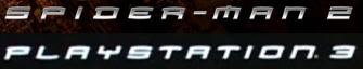
Although the PS3 logo has been revamped since its launch in 2006, its initial logo was what is referred to as "the Spider-Man font," taken from the most recent Spider-Man franchise. Although the article this image is sourced from does point out that a factor in PS3 using this font was that its maker, Sony, already owned the Spider-Man rights, the use of this typography is still effective in channeling the system's target demographic; the Spider-Man viewer audience of young males is also the target consumer group for video games, so using the identical typefaces was certainly a clever decision on Sony's part.2. The Walt Disney Company
(http://tinyurl.com/3qdl7sd)
The Walt Disney Company logo is one of the most iconic and easily-recognized in the world because of how distinct it is. The use of its founder's signature as its logo creates an emotional familiarity between consumer and corporation, one which the Disney brand is synonymous with. Disney fans are known to be extremely loyal as consumers, and the fact that the logo has remained the same basically since the company's inception has helped to keep this loyalty strong through the ages.
3. Nike
(http://tinyurl.com/3wk7q6h)
Like the Disney logo, Nike's is also iconic, but largely because of its signature "swoosh" symbol. The simple typography used on the word "NIKE" serves not to distract from the image. Seemingly made in "Impact" font, the typography is also italicized which works well given that Nike is a sporting goods company; the italics could be seen to represent swiftness, speed, or movement.
No comments:
Post a Comment